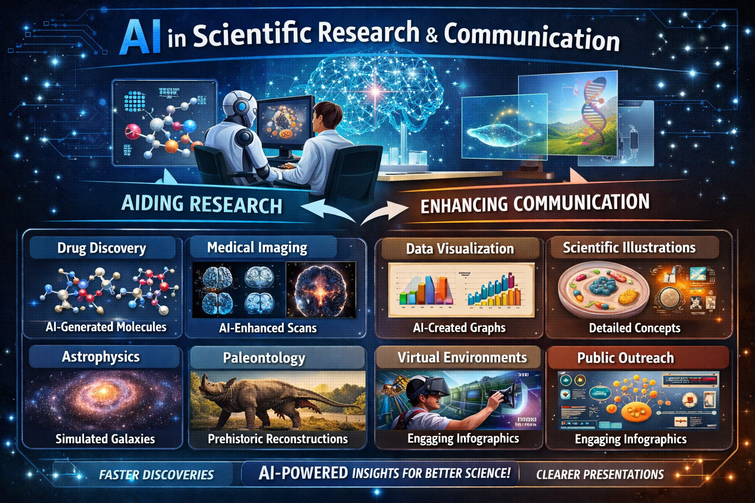
Science communication has a visual problem.
Most scientific concepts are visual at their core—molecular structures, geological processes, ecological relationships, astronomical phenomena. But most scientists aren't trained illustrators. And good science illustrators are expensive and busy.
The result: a lot of papers, presentations, and educational materials要么 rely on dense text to describe things that would be clearer as images, or use whatever visuals they can find, which may not quite match the concept.
AI image generation is starting to change this. Not by replacing science illustrators—at its best, it's enabling scientists to create visual explanations where none would have existed.
Conceptual Visualization
The clearest use case: illustrating concepts that are difficult or impossible to photograph.
A molecular biologist explaining protein folding. A geologist showing plate tectonics over millions of years. An astrophysicist describing what falling into a black hole might look like.
These aren't photographs. They're visual metaphors, conceptual illustrations. The accuracy requirement is different from, say, a technical diagram—what matters is that the viewer understands the concept.
AI can generate these conceptual images quickly. A climate scientist can produce visuals showing projected temperature changes under different scenarios. An educator can create illustrations of cellular processes tailored to different audience levels.
The images aren't perfect. They're interpretive, not precise. But they're visual communication, and that's the gap they fill.
The Paper Figure Problem
Academic papers need figures. Good figures make papers more readable and more likely to be cited. Bad figures—or no figures—reduce impact.
But creating figures takes time and skill. Graduate students spend hours wrestling with illustration software. Labs without design expertise produce papers with functional but uninspiring visuals.
AI generation offers a middle path: rough out figure concepts quickly, then either use them as-is for simple cases or have a professional refine them for high-stakes publications.
The caveat: AI-generated figures for papers need careful review. The model doesn't know whether the cellular structure it drew is accurate. The scientist has to verify and potentially edit. AI is a tool for creation, not verification.
Educational Materials
This is where AI visualization might have the biggest impact.
Textbooks, online courses, Khan Academy-style videos—all of these need huge numbers of images. A biology textbook alone might need hundreds of diagrams, and keeping them current and consistent is expensive.
AI can help generate visualizations at scale. Not replacing the careful work of science textbook illustrators, but supplementing it. Creating practice diagrams. Generating variations for assessment. Producing supplementary visuals for online materials.
For educators specifically: being able to generate a custom diagram that matches exactly what you're teaching, rather than searching for something close, changes how you prepare.
The Public Communication Gap
Scientists increasingly need to communicate directly with the public—through social media, public talks, articles, podcasts. The grant funding landscape often requires "broader impacts" and public outreach.
But most scientific training doesn't include visual communication. A researcher might have fascinating work but no way to show what it looks like.
AI generation bridges this gap. A marine biologist can create visuals of deep-sea organisms from descriptions. A physicist can illustrate quantum phenomena. A paleontologist can show what a newly described species might have looked like.
These images aren't photographs. They're interpretations. But they're also visual hooks that make scientific work accessible to audiences who wouldn't engage with text alone.
Limitations That Matter
Important caveats:
AI doesn't know truth from fiction. It can generate images that look like scientific visualizations but are completely wrong. The scientist must verify.
Accuracy isn't guaranteed. For educational or public communication, close enough might work. For technical papers, close enough is dangerous.
Scientific illustration is a profession. The best science visuals—think National Geographic, Nature covers, museum exhibits—are created by trained illustration professionals who understand both the science and visual communication. AI doesn't replace that expertise.
Attribution matters. If a paper uses AI-generated figures, that should be disclosed. Not because AI is shameful, but because transparency about methods is a scientific value.
What We're Seeing
On Artfelt, we've noticed scientists and educators using the platform for:
- Creating visuals for conference presentations
- Generating concept illustrations for grant proposals
- Producing teaching materials for courses
- Exploring visual representations of research topics
These aren't replacing formal publication figures. They're filling gaps where no visual would otherwise exist.
The Realistic View
AI image generation for science isn't perfect, and it isn't replacing human expertise. What it's doing is enabling visual communication in situations where the alternative was nothing.
A professor who can't afford an illustrator can now create diagrams for lectures. A graduate student can rough out figure concepts before spending hours on polished versions. A science communicator can generate visuals that match their narrative rather than searching for something close.
The bar being raised is from "no visual" to "good enough visual." That's a significant change.
Science has always relied on visual communication—from da Vinci's anatomical drawings to modern microscopy. AI is just the latest tool in a long tradition of using whatever technology is available to help people see what scientists are talking about.